Four and a half minutes. That’s how long it takes to bomb a 2-minute DI question.
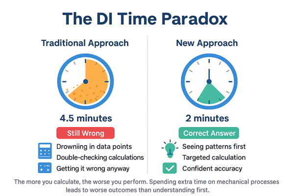
Not because you don’t know how to read charts. Not because you can’t do math. But because you’re drowning in data points, mechanically counting, double-checking calculations, and still somehow getting it wrong.
Here’s what nobody tells you about Data Insights: The more you calculate, the worse you perform.
Key Takeaway from This Data Insights Guide:
Data Insights isn’t about calculation speed – it’s about data comprehension. You’re likely wondering:
- Why do I spend 4+ minutes on 2-minute DI questions?
- How can I stop getting overwhelmed by complex charts?
- What’s the systematic approach that actually works?
This guide reveals the “Own the Dataset” method that transforms your DI performance immediately.
Why DI Feels Impossible
You open a Data Insights question. Multiple axes, overlapping data sets, and percentages to calculate. Your brain immediately kicks into high gear – start counting, start calculating, start solving.
While you’re meticulously counting every data point, you’re not actually understanding what you’re looking at. You’re processing numbers without context, calculating percentages without purpose, solving equations about situations you don’t comprehend.
The result? You spend four minutes on two-minute questions. You double-count overlapping data. You calculate wrong relationships because you never understood which relationships mattered. And worst of all, you’re exhausted and still getting it wrong.
Here’s What’s Actually Happening
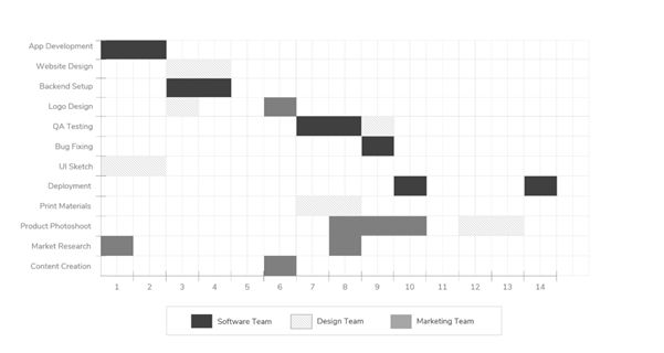
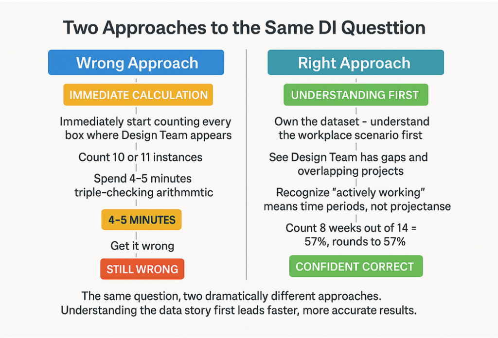
Look at this Gantt chart showing three teams working on projects over 14 weeks.
Question:
“To the nearest 5 percent, the number of weeks the design team is actively working on tasks is ___ percent of the total duration.”
What you do: Immediately start counting every box where the Design Team appears. Count 10 or 11 instances. Spend 4-5 minutes. Triple-check arithmetic. Get it wrong.
What you should do instead: Own the dataset. Before reading any question, spend 60 seconds understanding the chart as if it’s from your workplace.
⭐ KEY INSIGHT: Own the Dataset First
Before reading any question, spend 60 seconds understanding the chart as if it’s from your workplace. This transforms abstract data into meaningful workplace scenarios.
The Design Team (light grey bars):
- Is working on Website Design early on,
- has a gap, then picks up Logo Design,
- another gap,
- then UI Sketch and Print Materials.
But notice something crucial – in weeks 9-10, they’re working on TWO projects simultaneously (UI Sketch and Print Materials overlap).
- The Marketing Team is absolutely slammed in weeks 7-10, juggling multiple projects.
- The Software Team has the most consistent workload with fewer gaps.
Now you understand the workplace scenario. This isn’t abstract data – it’s three teams with varying workloads, some overwhelming periods, some gaps.
NOW look at the question. It’s asking for the percentage of weeks the Design Team is “actively working.” Not the number of project boxes. Not the total project weeks. The number of weeks they’re actively working.
Because you understood the chart first, you immediately recognize the critical distinction: weeks 9-10 count as 2 weeks of active work, not 4 (even though they’re doing two projects). You won’t double-count.
Count the weeks where Design appears:
- Weeks 2-4 (Website Design),
- Week 6 (Logo Design),
- weeks 8-10 (QA Testing into overlapping projects),
- and week 14 (Print Materials).
That’s 8 weeks out of 14.
8/14 ≈ 57%, rounds to 60%.
The answer is 60%.
⭐ Key Insight: You didn’t get this right because you’re good at counting. You got it right because you understood what you were looking at before you started calculating. You saw overlapping responsibilities, not just boxes to count.
The students who get this wrong? They count 10 or 11 instances because they count each project box separately. They take 4-5 minutes double checking their arithmetic. They still get it wrong because they never understood what they were counting.
The “Owning the Dataset” Method
Owning the dataset means treating every DI chart like it’s from your workplace, not from a test. It means understanding before calculating, seeing patterns before counting points, and recognizing relationships before computing ratios.
Think about it – when your manager shows you a utilization chart, do you immediately start calculating? No. You first understand what’s happening – which teams are overloaded, where bottlenecks exist, and what the patterns suggest. Only then do you calculate specific metrics that matter.
This is exactly how you interact with data in real life. When reviewing your portfolio, you don’t calculate every percentage – you look for trends. When checking your budget, you don’t compute every ratio – you identify patterns.
The GMAT rewards this practical thinking. They’re not testing arithmetic (they give you a calculator). They’re testing whether you can extract meaning from data – exactly what you’ll do in business school and beyond.
➡️ The key shift: See DI charts as real workplace data that tells a story, not as abstract test questions requiring calculations.
Your New DI Protocol
⚙️ Your 5-Step DI Protocol
Step 1: Don’t Look at Questions Yet
60-90 seconds with just the chart and description. Resist the urge to see what they’re asking.
Step 2: Make It Real
“If this were from my workplace, what would I notice?” Treat it as real data affecting real decisions.
Step 3: Extract 2-3 Observations
Who’s busy? What patterns emerge? What relationships matter? These are observations, not calculations.
Step 4: Now Read and Plan
Look at the question. Before calculating, map out:
- What’s being asked
- Can observation alone answer this?
- If not, what specific calculation is needed?
Step 5: Calculate Last
Only if necessary. Targeted calculation where you know exactly what you’re computing and why. This should be 10% of your effort.
Your Practice Fix
Take 20-25 incorrect DI questions you’ve already attempted. Apply this exact process even though you know the answers. You’re not practicing for correct answers – you’re rewiring your brain’s approach.
For each question:
- Cover the questions
- Spend the full 60 seconds observing
- Write down 2-3 observations
- Uncover the question and create the decision matrix
- Note when you feel the urge to calculate prematurely
After mastering this on old questions, create a 5-question fresh quiz. If you complete only 3 but own those datasets, that’s success. Quality over quantity.
❗ Critical Checkpoint
If you’re calculating before Step 5, you haven’t owned the dataset. This is the most common mistake that keeps students stuck in the calculation trap.
The Bottom Line
Data Insights isn’t testing calculation skills. It’s testing whether you can extract meaning from data.
Tomorrow’s practice: One DI set. Track time spent understanding versus calculating. If more than 20% is calculation, you’re still in the wrong mode.
The transformation is immediate. Once you start owning datasets instead of processing them, accuracy jumps and timing drops. Not because you calculate faster, but because you finally understand what to calculate.
⭐ Key Takeaway: Stop solving. Start seeing. The questions answer themselves.
⭐ Master Data Insights with Strategic Practice
Ready to transform your DI approach? Start with our comprehensive resources:
- ✅ 15+ hours of Data Insights strategy lessons
- ✅ 200+ DI practice questions with “Own the Dataset” explanations
- ✅ Free adaptive mock test featuring DI section
- ✅ Personalized study plan for DI mastery