Common sense suggests we should spend more time on tasks we find difficult. If you’re struggling with something, work harder at it. Invest more time. Practice more. This logic has guided educational approaches for generations.
But recent analysis of performance data from thousands of GMAT test-takers reveals a startling truth: we systematically spend less time on question types where we perform worst.
Key Insights from GMAT Data Analysis:
Analysis of official GMAC performance data from 50,000+ GMAT Focus test attempts reveals counterintuitive patterns:
- ⚡ Time Paradox: Students spend less time on question types where they perform worst
- ⚡ Visualization Trap: Graphics appear easier but yield 30% lower accuracy than tables
- ⚡ Adaptive Algorithm Impact: Medium-question errors prevent access to high-scoring difficult questions
- ⚡ Strategic Implications: Conventional preparation wisdom systematically fails for Data Insights
This analysis reveals why traditional approaches to GMAT Data Insights preparation miss the mark.
⭐MASTER DATA INSIGHTS WITH STRATEGIC PRECISION
Access our Free Data Insights Masterclass including systematic frameworks for all 5 question types, performance analytics insights, and adaptive practice questions designed using official GMAC research.
The Counterintuitive Performance Pattern
The data comes from GMAC’s official analysis comparing Indian test-takers to global averages across the five question types in the GMAT Focus Data Insights section. What emerged wasn’t just a pattern of performance differences, but a window into fundamental flaws in how humans approach complex analytical tasks.
Consider this: Graphics Interpretation questions, where Indian students achieve just 42% accuracy, receive an average of only 115 seconds per question. Meanwhile, Table Analysis questions, with a robust 72% accuracy rate, command 165 seconds each. The same pattern holds globally.
⭐ Key Insight: This isn’t just a quirk of test-taking behavior. It’s a systematic cognitive error that has profound implications for anyone making high-stakes decisions based on data analysis.
The Visualization Paradox: Why Harder Formats Work Better
The most striking discovery lies in comparing Graphics Interpretation (GI) and Table Analysis (TA) questions. Here’s what makes this fascinating: both question types test identical analytical principles. Students must identify trends, calculate relationships, interpret data ranges, and draw logical conclusions. The underlying cognitive demands are virtually indistinguishable.
Yet the performance gap is enormous—72% accuracy for TA versus 42% for GI.
The difference? Table Analysis forces active visualization while Graphics Interpretation presents pre-digested visuals.
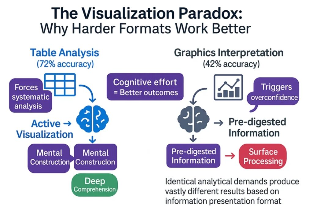
When confronted with raw tabular data, students must mentally construct relationships. They sort columns, compare rows, and build their own visual understanding. This cognitive work—this apparent “inefficiency”—actually leads to deeper comprehension and better decision-making.
Graphics Interpretation, on the other hand, offers the seductive promise of immediate understanding. Charts and graphs create an illusion of accessibility. Students glance at a bar chart or scatter plot and think, “I can read this.” They process quickly, decide confidently, and move on.
⚡ The very “helpfulness” of visual presentation becomes a trap.
This reveals a profound paradox in learning and decision-making: formats that require more cognitive effort often produce better outcomes. The inconvenience of tables isn’t a bug—it’s a feature.
The Medium-Question Trap in Adaptive Testing
The GMAT’s computer adaptive format adds another layer of complexity that most test-takers—and their advisors—fundamentally misunderstand. In adaptive testing, early mistakes create permanent score ceilings.
Here’s how it works: when you answer questions correctly, the algorithm serves harder questions worth more points. Answer incorrectly, and you’re directed toward easier questions with lower scoring potential. This creates what we might call “untapped ability”—where a student’s true capability in difficult questions never gets measured because medium-question errors prevented access to that difficulty tier.
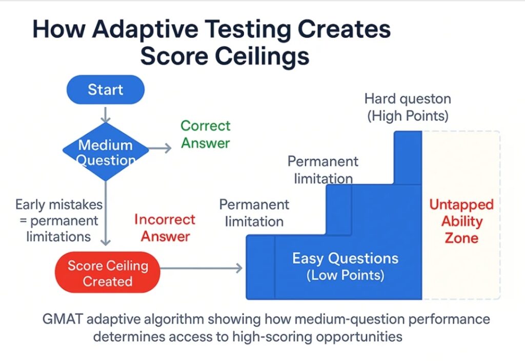
Data Sufficiency and Table Analysis questions, which have lower overall difficulty levels, become gatekeepers to higher scores. These aren’t just questions you need to get right—they’re the questions that determine whether you’ll even see the problems that could showcase your analytical abilities.
⚠️ Critical Understanding: For students targeting DI scores of 82 or higher, perfectionism on medium questions matters more than improvement on hard questions.
Consider a student who can solve 70% of hard Graphics Interpretation questions—an impressive ability. But if they’re only hitting 65% on medium Data Sufficiency questions, they may never encounter those hard GI questions that could demonstrate their true skill level.
The adaptive algorithm doesn’t care about your potential; it only responds to your demonstrated performance in real-time.
❓Wondering About Your Adaptive Performance?
Take our SigmaX adaptive mock test to understand exactly how the algorithm responds to your performance patterns. Get detailed analytics showing your difficulty progression and score ceiling factors.
The Score-Target Strategy Matrix
Understanding adaptive mechanics leads to dramatically different preparation strategies based on score targets:
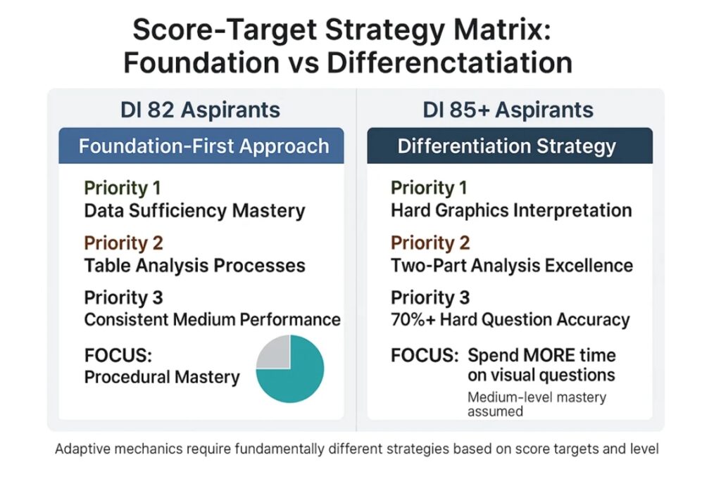
For DI 82 Aspirants: The Foundation-First Approach
- Priority 1: Achieve near-perfect accuracy on Data Sufficiency (typically 5-7 questions per test)
- Priority 2: Master Table Analysis systematic processes (2-3 questions, but high-stakes gatekeepers)
- Priority 3: Build consistent medium-level performance across all question types
- Time allocation: Invest heavily in procedural mastery of “easier” questions
For DI 85+ Aspirants: The Differentiation Strategy
Assumption: Medium-level mastery already achieved
- Priority 1: Develop systematic approaches to hard Graphics Interpretation questions
- Priority 2: Excel in Two-Part Analysis questions (highest difficulty spread = highest differentiation potential)
- Priority 3: Achieve 70%+ accuracy rates on the hardest questions in each category
- Time allocation: Counter-intuitive time investment—more time on visual questions, not less
⚡ Critical Insight: The highest scorers must resist every natural instinct about time allocation. They must spend MORE time on questions that appear easier, not less.
Myth-Busting: The Multi-Source Reasoning Misconception
Ask any GMAT preparation forum about the “hardest” Data Insights question type, and you’ll consistently hear: Multi-Source Reasoning. Students fear the multiple tabs, the information integration requirements, the apparent complexity.
The data tells a different story.
With approximately 60% accuracy rates, MSR significantly outperforms Graphics Interpretation’s dismal 42%. Students actually do better on the “scary” question type than on the one they rush through with confidence.
➡️ Revelation: This reveals something crucial about human psychology and task assessment: our intuitions about difficulty are systematically wrong.
Multi-Source Reasoning appears intimidating—multiple information sources, tabbed interfaces, complex scenarios. But this apparent complexity actually provides structure. Students approach MSR questions with appropriate caution, read carefully, and work systematically.
Graphics Interpretation, by contrast, triggers overconfidence. It looks manageable, familiar, straightforward. Students scan quickly, make decisions rapidly, and move on—often missing critical details that would have been obvious with more careful analysis.
The lesson extends far beyond standardized testing: in high-stakes environments, structured complexity often produces better outcomes than deceptive simplicity.
The False Confidence Effect in Visual Data
Why do graphics trigger such systematic overconfidence? The answer lies in how our brains process visual information.
When we look at a chart or graph, pattern recognition systems activate immediately. We see trends, identify relationships, and form conclusions with remarkable speed. This evolutionary advantage—rapid visual processing—becomes a liability in analytical contexts that require precision.
The brain generates what psychologists call “fluency”—a feeling of ease and familiarity that we interpret as understanding. A well-designed bar chart feels comprehensible at first glance. We think we “get it” because the visual processing was smooth.
But true analytical understanding requires much more:
- Attention to scale and axis details
- Recognition of what’s NOT shown in the data
- Consideration of alternative explanations
- Integration of multiple data points into coherent conclusions
Table Analysis, by forcing manual visualization, naturally promotes this deeper analytical process. Students must actively construct understanding rather than passively receive it.
⚠️ Business Implication: In boardrooms around the world, executives make critical decisions based on dashboard visualizations that may be triggering the same false confidence effect. The prettier the presentation, the less likely we are to question the underlying analysis.
The Anti-Intuitive Framework: A New Approach
Based on these insights, what would an effective approach look like? It requires systematically working against natural instincts:
Time Allocation Against Intuition
- Spend MORE time on Graphics Interpretation, not less
- Budget 3+ minutes per GI question instead of the typical 2 minutes
- Treat visual questions as requiring the same systematic approach as tables
- Use time investment as a forcing function for deeper analysis
Master Medium Before Attacking Hard
- In adaptive testing, medium-question perfection unlocks high-difficulty, high-value problems
- Practice medium questions until accuracy approaches 90%
- Develop systematic processes for “easier” question types
- Remember: the hardest part of hard questions is getting to see them
Use Difficulty Spread as Strategic Compass
- Two-Part Analysis has the highest difficulty spread, making it the ultimate score differentiator
- Questions with wide difficulty ranges offer the highest upside potential
- Focus improvement efforts on question types with the most “room to grow”
Build Systematic Processes Against Natural Tendencies
- Develop checklists for visual analysis that force systematic examination
- Practice deliberate slowness on questions that “feel” easy
- Create forcing functions that prevent rush-to-judgment behaviors
↗️Apply Anti-Intuitive Strategies with Expert Guidance
Ready to implement these counterintuitive approaches? Access our comprehensive Data Insights framework including:
- Systematic checklists for visual analysis
- Medium-question perfection drills
- Adaptive performance tracking
- Time allocation strategies against natural instincts
Analysis based on official GMAC research examining performance patterns from more than 50,000 GMAT Focus test attempts. Performance metrics reflect aggregate data comparing test-takers in India to global averages across all Data Insights question types.